Balancing Button Styles: Optimizing for Long and Short Text Labels
Not all product labels are created equal. A simple "S" for Small requires a very different visual treatment than a descriptive label like "Extra-Large Tall." Our app allows you to create distinct rules for Long Text and Short Text to ensure your buttons always look intentional and balanced.
Why Differentiate Between Text Lengths?
Standard Shopify themes often stretch all buttons to the same width, leaving small labels with too much empty space and long labels feeling cramped. By optimizing these separately, you:
Improve Readability: Text remains clear and doesn't wrap awkwardly.
Save Screen Space: Small labels stay compact, leaving more room for images.
Maintain Professionalism: Your store avoids the "unbalanced" look of mismatched button widths.
Configuring Short Text (e.g., S, M, L, XL)
Short labels are best suited for compact, uniform shapes.
The Goal: Create a clean, grid-like appearance.
Width Control: Use a "Fixed Width" or tight padding so these buttons appear as perfect squares or small pills.
Best Styles: Button Pill or Standard Button.
Pro Tip: Since these buttons are small, you can afford to use a slightly larger font size or bolder weight to make them pop.
Configuring Long Text (e.g., "Midnight Black," "Large/Tall")
Longer labels need room to breathe to avoid cluttering the interface.
The Goal: Ensure the text remains on a single line without overlapping the button borders.
Adaptive Padding: Set these buttons to "Auto Width" so the button grows naturally with the length of the text.
Text Color & Contrast: For longer strings of text, use high-contrast HEX codes (e.g., pure black text on a light gray background) to ensure it’s readable at a glance.
Best Styles: Button or Dropdown with Label.
How to Apply These Settings
Navigate to the Customize Styles tab in the app dashboard.
Select the Product Page toggle at the top.
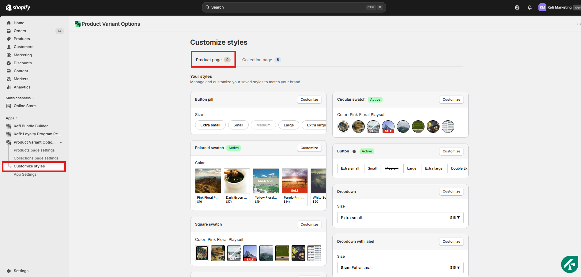
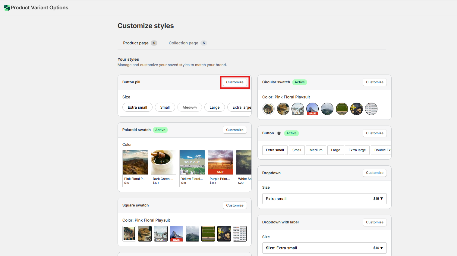
Click Customize next to your chosen Button style.
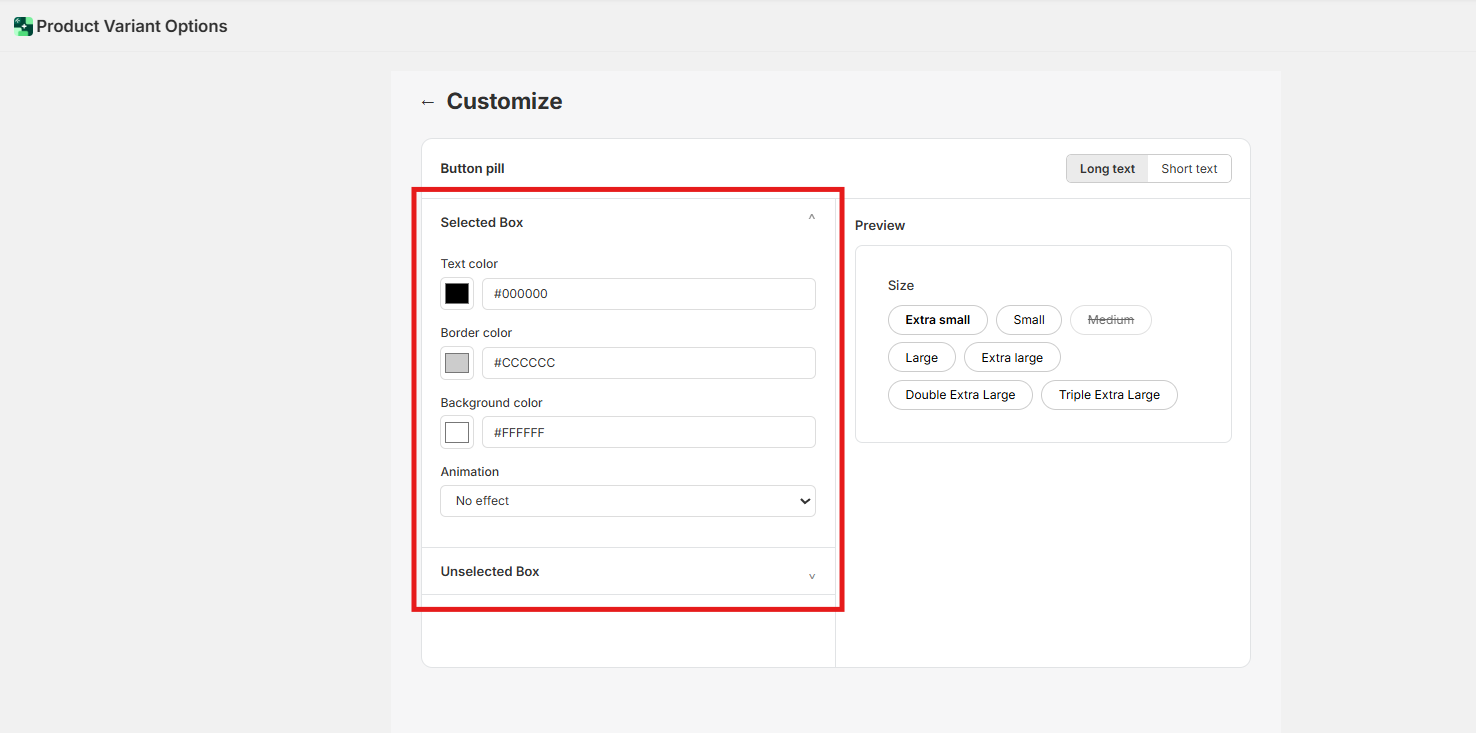
Inside the editor, you will see separate configuration sections for Short Labels and Long Labels.
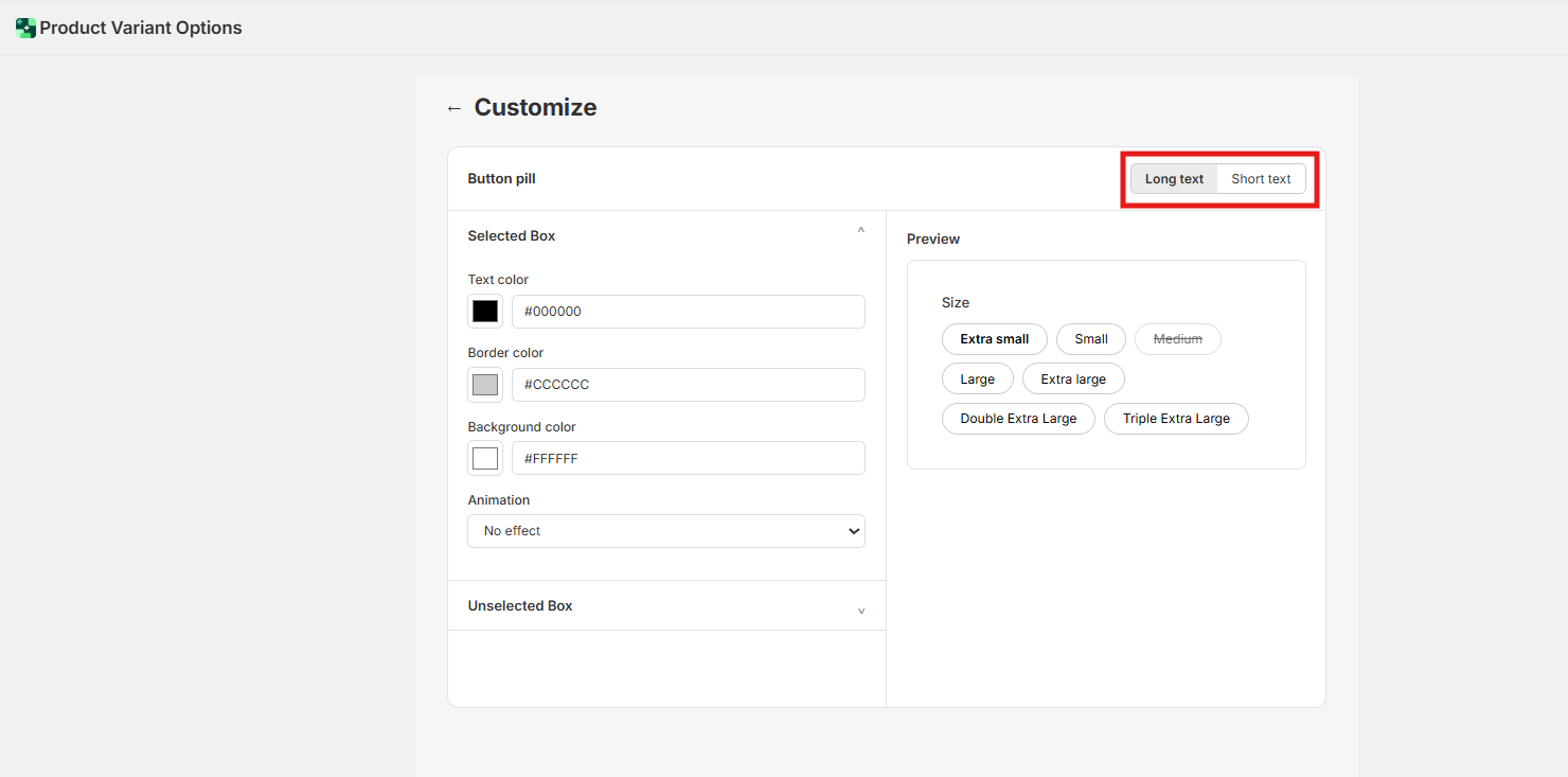
Adjust the Colors, Borders, and Backgrounds for each.
Visual Hierarchy: The Selected State
A key part of optimizing text is how it changes when clicked.
For Short Text: A simple background color flip (e.g., White to Black) is usually enough.
For Long Text: Since there is more "surface area," consider using a Shadow or Glow animation rather than a heavy background color change, which can sometimes look too bulky on a large button.
Pro Tip: The "Active" Badge
As you tweak your text settings, always look for the green Active badge in your style list. This confirms you are editing the style that is currently live, allowing you to see how your "Long" and "Short" labels look side-by-side on your storefront.
Need Help?
Our support team is dedicated to helping you build a beautiful storefront:
Live Chat: Available directly within the app dashboard.
Email Support: [email protected]